
Best AI Prompts to Create Stunning YouTube Thumbnails for Free
Most people who start using AI to create YouTube thumbnails make the same mistake immediately. They write prompts for the thumbnail they want to be proud of rather than the thumbnail a viewer will click on. Those are different things and until you feel the specific frustration of publishing a video with a beautiful thumbnail that earns a 2 percent click-through rate, the difference is not obvious.
The prompts in this guide are built for clicks. Not for compliments. Here is what makes them work and how to use them correctly.
Why Most AI-Generated Thumbnails Fail at the Moment That Matters
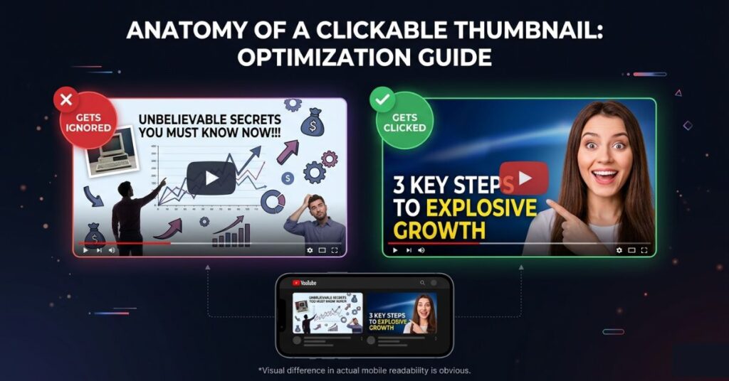
A thumbnail is never evaluated by someone who is giving it their attention. It is evaluated by someone who is giving it a fraction of a second while their eyes are already moving to the next option. That is the context where every thumbnail either earns a click or disappears, and it is almost never the context that creators imagine when they are designing them.
Most AI thumbnail prompts are written as though the image will be displayed on a wall. Rich detail, layered composition, complex background effects, multiple visual elements carefully balanced. The prompt-writer imagines someone appreciating the finished image. What actually happens is a viewer on a phone screen sees a 320 x 180 pixel version of that image between two other thumbnails and their brain makes a pattern recognition decision in under half a second.
At that size, rich detail becomes visual noise. Complex composition becomes unclear. The eye cannot find a focal point because there are six of them competing simultaneously. The thumbnail that looked extraordinary at full size looks indistinguishable from the others at the size that actually matters.
The entire foundation of writing better AI thumbnail prompts is encoding for this reality from the first word of the prompt. Not describing the most visually impressive image. Describing the most immediately readable one.
The Visual Principles That Separate Clicked Thumbnails From Ignored Ones
These are not design rules invented for aesthetics. They are patterns extracted from what actually performs across millions of YouTube videos, and every one of them has a specific reason for existing.
High contrast is the first and most fundamental. A thumbnail that works on a phone screen requires the foreground element to stand sharply apart from whatever is behind it. This sounds obvious until you generate a beautiful AI image with a person standing against a richly detailed background that reads perfectly at full size and becomes an indistinguishable blob at thumbnail scale. Every prompt in this guide specifies high contrast explicitly because leaving it out is the single most common quality-reducing omission.
One focal point. Not two, not three. A face, a dramatic background, and a text element are three things competing for a viewer’s eye at thumbnail size. The thumbnail where one element is clearly dominant, and the other elements support rather than compete, is the one where the viewer’s attention lands somewhere specific. Landing somewhere specific is what creates the sub-second curiosity that produces a click.
Text must be short, heavy and high contrast. At mobile thumbnail size, text smaller than roughly 20 percent of the image height is not readable, it is a smudge. Three words that create tension or curiosity work at thumbnail size. A seven-word explanation does not. The Canva font choices that work for thumbnails are the ones that feel too bold in isolation: Impact, Bebas Neue, Montserrat Bold, Anton. These look aggressive at full size and readable at thumbnail size, which is the correct trade-off.
The most underrated thumbnail principle: emotional expression outperforms subject matter. A genuine human face expressing a strong, recognisable emotion, shock, excitement, concern, delight, draws the eye and creates an involuntary mirror response in the viewer. They feel a flicker of the emotion before they consciously decide whether to click. This is not a cynical manipulation. It is how human visual attention works. Thumbnails that exploit it consistently earn higher click-through rates than equivalent thumbnails without faces, regardless of the video topic.
The AI Tools Worth Using for Thumbnails
Three tools are worth knowing and each has a specific strength that the others do not match.
Adobe Firefly at firefly.adobe.com is the strongest free tool for photorealistic human faces and cinematic compositions. When a thumbnail needs a realistic person with a specific expression, in front of a specific background, with controlled lighting that separates them cleanly from the scene, Firefly produces output that other free tools cannot consistently match. It also has Adobe’s explicit commercial use guarantee, which matters if you monetise your channel or produce content for clients.
Google Gemini at gemini.google.com handles creative, concept-driven thumbnails better than Firefly. For thumbnails that are more graphic and illustrative than photographic, for bold conceptual images with strong color treatment and stylized environments, Gemini interprets creative prompts more freely and often more interestingly. The iteration speed is also fast, which makes testing variations less tedious.
Microsoft Designer at designer.microsoft.com occupies a useful middle ground: it generates images and allows text overlay within the same interface. For creators who want to produce a finished thumbnail in one tool rather than generating in Firefly and finishing in Canva, Designer handles both steps. The image generation quality is slightly below Firefly’s for photorealistic content but acceptable for most thumbnail styles.
For text overlay work specifically, Canva remains the fastest tool regardless of where the base image came from. Generate in Firefly or Gemini, download the image, upload to Canva at 1280 x 720 pixels, and add text there. The font library and text effect tools in Canva are better for thumbnail text than anything available inside the generation tools themselves.
The Exact AI Prompts That Work (Copy These)
Each prompt is built to encode the visual principles above. The bracketed sections are the variables you personalise for each video.
Prompt 1: The Reaction Face Thumbnail (The Highest Click-Through Format on YouTube)
This is not an opinion. A face with a strong visible emotion is the single most consistently high-performing thumbnail format across YouTube, and it has been for years. The prompt below generates a clean, production-ready version.
Create a YouTube thumbnail background image. A [man/woman], [approximate age], with an expression of [shocked/excited/concerned/delighted] looking directly at the camera. The face fills approximately 60 percent of the frame, positioned slightly left of center. Behind the subject, a [color] gradient background transitioning from [darker shade] on the left to [brighter shade] on the right. Cinematic rim lighting separates the subject cleanly from the background. High contrast throughout. Photorealistic style. 1280x720 pixels. Leave the right third of the image completely empty for text overlay. No text anywhere in the image.Use shocked or surprised for reveal and comparison videos. Make use excited for tutorials and how-to content. Use concerned or serious for problem-solving and educational topics. The emotion does not need to literally describe the video. It needs to create a question that the title then answers.
Prompt 2: The Bold Concept Thumbnail (For Idea-Led and Topic-Driven Content)
For videos where the concept matters more than a face, a single dominant visual element against a high-contrast background consistently outperforms busy compositions.
Create a YouTube thumbnail image with one single dominant visual element: [describe the subject clearly, e.g. a glowing smartphone, a golden padlock, a cracked phone screen, a stack of coins, a bright light bulb]. The subject is large, centred, and occupies 70 percent of the frame. Behind it, a deep [color] gradient background with visible light rays or a radial glow emanating from directly behind the subject. The subject has sharp clean edges and vivid colour treatment. High contrast between subject and background. Modern, premium, editorial style. 1280x720 pixels. Leave the bottom left quarter empty for text. No text in the image.Prompt 3: The Before/After Split Thumbnail (For Transformation and Comparison Content)
Split comparisons produce one of the clearest visual narratives available in a single image. The viewer immediately understands the structure and wants to know how the transformation happened.
Create a YouTube thumbnail showing a split-screen comparison divided vertically down the centre. Left half shows [describe the 'before' state clearly, e.g. a dim cluttered phone screen, a plain document with no formatting, a poorly lit photo with flat colours]. Right half shows [describe the 'after' state, e.g. a bright fast phone screen with clean layout, a professionally formatted document, a sharp vivid well-lit photograph]. A bold glowing vertical line separates the two halves. Left side uses cool desaturated tones. Right side uses warm vivid tones. High contrast throughout. Photorealistic. 1280x720 pixels. Leave the top centre clear for a short text overlay. No text in the image.Prompt 4: The Number Thumbnail (For List, Ranking, and Top-X Content)
A large bold number in a thumbnail signals to the viewer that the video has a clear, structured payoff. It creates immediate expectation.
Create a YouTube thumbnail. A bold oversized number '[your number, e.g. 7]' dominates the left half of the frame in a heavy display font. The number is rendered in [gold/white/electric red] with a subtle three-dimensional emboss or drop shadow effect. It is the most visually prominent element in the image. The right half of the frame shows [describe a relevant visual, e.g. a smartphone, a stack of documents, a glowing AI interface]. Background is a dark gradient from near-black to deep [blue/purple/red]. High contrast throughout. Cinematic, editorial style. 1280x720 pixels. No additional text.Prompt 5: The Bold Statement Text Thumbnail (For Opinion and Reveal Content)
For videos where the message is the hook, a text-led design where the visual exists to frame the words rather than compete with them often outperforms image-led alternatives.
Create a YouTube thumbnail with a text-led design. The primary visual area is reserved for bold capital text: '[your 3 to 5 word statement, e.g. STOP DOING THIS WRONG / YOU HAVE BEEN LIED TO / THIS CHANGED EVERYTHING]'. The text should be white with a heavy dark outline or shadow so it reads against any background. Behind the text, a dynamic background of [bold colour gradient / dramatic clouded sky / abstract light streaks] that provides visual energy without competing with the words. High contrast. Text readability at small sizes is the priority. 1280x720 pixels. No other visual elements beyond the background treatment.Prompt 6: The Product or Tool Showcase Thumbnail (For Reviews, Tutorials, and How-To Content)
For tutorials and reviews, showing the product or tool prominently communicates the subject of the video before the viewer reads the title.
Create a YouTube thumbnail. The central element is [describe the product or tool, e.g. a modern Android smartphone at a three-quarter angle, a laptop showing a video editing interface, an AI chat tool on a clean screen]. The product is large, well-lit with dramatic studio lighting showing visible highlights and reflections. It looks premium and desirable. Background is a clean [color] gradient with a subtle radial glow behind the product. High contrast between the product and background. Photorealistic. 1280x720 pixels. Leave the upper left area and lower right corner clear for text placement. No text in the image.What to Do After Generating the Image
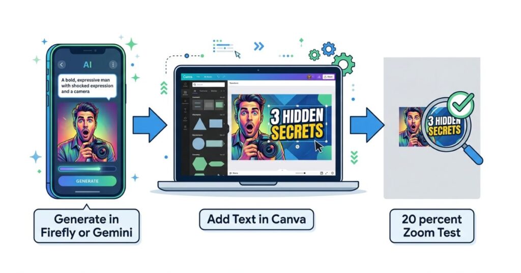
The AI produces the base. What happens next determines whether that base becomes a thumbnail that earns clicks or one that sits there looking decorative.
Adding Text in Canva
Download the generated image and open Canva. Create a custom design at exactly 1280 x 720 pixels. Add the image as the background layer.
Five words maximum for text. Three is the working target. Think about it this way: the text is not there to explain the video. The video title is there to explain the video. The text on the thumbnail is there to create a single moment of “wait, what?” that makes the viewer read the title. “I Was Wrong” creates that moment. “Everything You Need to Know About Using AI for Productivity in 2026” does not exist at thumbnail size.
The Canva fonts that work for thumbnails are the ones that feel slightly too aggressive at full size: Bebas Neue, Impact, Anton, Montserrat ExtraBold. Thin or decorative fonts look refined in your Canva preview and disappear entirely in a YouTube search result. Choose the heaviest version of whatever font you pick.
Every text element needs a drop shadow, outline or solid background box behind it. Without contrast treatment, even the boldest white text becomes illegible against a complex background at thumbnail scale. Two seconds of adding a text shadow is the difference between readable and invisible.
For deciding which design tool to actually build the thumbnail in, Canva and Adobe Express compare differently depending on what you need from the free tier.
The 20 Percent Zoom Test
Before downloading anything, zoom the design to 20 percent in Canva. This is approximately the size at which a viewer on a phone evaluates your thumbnail. At that zoom level, ask three questions: Is the main focal element immediately obvious? Can the text be read without effort? Does the composition feel distinct or does it blend into imagined neighbours?
If the answer to any of these is no or not sure, the thumbnail is not ready. Adjust contrast, enlarge or simplify the text, or remove competing elements before exporting.
This test catches more problems than any design critique. The thumbnail that fails at 20 percent zoom fails in the real world. The one that passes is worth publishing.
What Actually Matters More Than the AI Tool You Use
There is a reason some thumbnails earn an 8 percent click-through rate and others earn 2 percent on identical channels posting to identical audiences. It is rarely the visual quality of the image. It is whether the thumbnail communicates the right thing to the right person at the right moment of intent.
Think about a viewer who just typed “how to speed up slow Android phone” into YouTube search. They are frustrated and have probably been putting up with a slow phone for weeks. They want a solution that actually works and they are slightly skeptical that any video will deliver one. The thumbnail that earns their click is the one that most directly communicates “this video will solve exactly what you are experiencing.”
That might be a frustrated face next to a phone and three words saying “Finally Fixed It.” That might be a dramatic before-and-after split of a phone performance screen. What it is almost certainly not is a beautifully rendered abstract image with subtle color gradients that looks impressive but communicates nothing specific.
Writing AI thumbnail prompts for performance means asking one question before the prompt is written; what does the person who just typed this search query most need to feel in order to click? Certainty that this video has the answer? Curiosity about something they did not know they did not know? Recognition of their own frustration in a face? The answer to that question drives the prompt. The AI tool you use to execute it is the last variable not the first.
Thumbnails are one part of the YouTube workflow, for the video itself free Android video editing apps without watermarks have improved significantly in 2026.
Common Mistakes That Kill Click-Through Rates
Too much visual complexity at full size. A beautifully detailed composition that collapses into noise at thumbnail scale is not a design achievement. It is a performance liability. Every element added to a thumbnail is another element competing for a viewer’s eye at 320 x 180 pixels. The discipline of removing elements not adding them, is what improves thumbnails over time.
Baking text into the AI-generated image. Every AI tool occasionally generates misspellings, distorted letters, or inconsistent character sizes in images. If you rely on the AI to place your thumbnail text correctly, you will periodically publish thumbnails with embarrassing errors. Always generate the image without text and add it as a separate layer in Canva. This also makes testing different text versions fast and free.
Choosing font weight based on aesthetic preference. Thin fonts look sophisticated at full size. They are invisible at thumbnail size. The font choice that feels too bold in Canva preview is almost always the right choice for YouTube. Make peace with heavy typography. It exists for exactly this context.
Matching the thumbnail to the video content rather than to the viewer’s desire. A finance video does not need gold coins and dollar signs because the topic is finance. It needs the visual that communicates what the viewer wants to feel: confident, informed, ahead of others who are not watching. A cooking video does not need to show food. It might earn more clicks showing a face of genuine surprise above text saying “I Can’t Believe This Works.” Match the thumbnail to the viewer’s psychology, not to a visual description of the video.
Not testing variants. YouTube Studio allows A/B thumbnail testing for eligible channels. Generating two or three variations using the prompts above and running them against each other produces real data about what your specific audience responds to. Channels that consistently test thumbnails improve click-through rate over time in a measurable, compounding way. Channels that do not eventually plateau and wonder why growth stalled.
Which AI Tool for Which Thumbnail Style
| Thumbnail Style | Best Tool | Specific Reason |
|---|---|---|
| Realistic face with expression | Adobe Firefly | Photorealistic face quality, commercial licensing |
| Cinematic dramatic scene | Adobe Firefly | Strong lighting and environmental rendering |
| Graphic and illustrated style | Google Gemini | Creative interpretation, current visual trends |
| Full thumbnail in one tool | Microsoft Designer | Generation and text overlay without switching tools |
| Fast concept iteration | Google Gemini | Quick generation, good for testing multiple ideas |
| Commercial client thumbnails | Adobe Firefly | Explicit commercial use guarantee |
Building a Consistent Thumbnail Style That Compounds Over Time
A single great thumbnail earns clicks for one video. A consistent thumbnail style earns clicks before the title is read, because returning viewers recognize your visual identity in a search result the same way they recognize a friend’s face in a crowd.
This is the compounding return on thumbnail consistency that almost no creator talks about because the individual benefit of any single thumbnail is hard to attribute to style consistency. The collective benefit, measured over months of publishing and returning viewer behaviour, is real and significant.
Building a consistent style means fixing three things across every thumbnail and varying only the content within them. A primary and secondary color palette. A consistent font family for text overlays. A recurring compositional structure such as face-left with text-right or centered object with text below. These three fixed variables create the recognizable pattern. Everything else can vary.
When you save your most successful AI prompts with your channel’s color palette baked in, your preferred compositional structure specified and only the subject-specific elements left as variables, you are building a template that produces faster, more consistent outputs over time and a channel visual identity that accumulates recognizability with every video published.
When AI-Generated Thumbnails Reach Their Limit
AI thumbnail generation covers the majority of use cases well. There are situations where it is not the right answer and being honest about this saves time.
On channels where the creator’s face is the primary audience draw, an AI-generated stranger’s face is a weaker signal than the creator’s own face regardless of how well it is generated. Subscribers have an established relationship with a specific face. That face in a thumbnail is a recognized brand asset. The AI face is compelling to a stranger and meaningless to a returning viewer. For channels at this stage, using a real photo as the thumbnail base and AI for background and composition enhancement is more effective than full AI generation.
For thumbnails that need to include actual footage from the video, a screenshot from a genuinely dramatic or surprising moment in the video is almost always a stronger thumbnail than an AI interpretation of that moment. Real footage carries authenticity that generated images cannot replicate for audiences who have watched enough YouTube to recognize the difference.
What You Should Do. Step by Step.
Step 1: Before writing any prompt, identify the viewer’s emotional state at the moment of the search. What are they feeling? What do they want to feel after clicking? This drives the visual message.
Step 2: Choose the prompt format that matches your video type: face-with-emotion for personality content, bold concept for topic-driven videos, before/after for transformation content, number for list videos, text-dominant for reveal and opinion content, product showcase for tutorials and reviews.
Step 3: Open firefly.adobe.com or gemini.google.com. Fill in the variables in the chosen prompt specifically for this video. Generate three to four variations.
Step 4: Download the strongest output. Open Canva, create a new design at 1280 x 720 pixels, and upload the image as the background.
Step 5: Add a text overlay using a heavy font. Maximum five words. Apply drop shadow or outline. Position text in the open area the prompt left clear.
Step 6: Zoom to 20 percent. Verify focal element clarity and text readability at that size.
Step 7: Export as PNG at maximum quality. Upload to YouTube Studio.
Step 8: If A/B testing is available in YouTube Studio, generate a second variation and test both. Review performance after 48 to 72 hours.
Frequently Asked Questions
Final Thoughts
There is a specific feeling that comes with posting a video and watching the click-through rate sit at 2 percent while a video with a tenth of your production quality earns 7 percent because its thumbnail is more clickable. It is one of the more instructive frustrations in content creation because it forces a direct confrontation with what actually drives viewer decisions.
Viewers do not click on the most impressive image. They click on the image that, in a fraction of a second, most clearly communicates that the video is worth their attention for their specific reason for being on YouTube at that moment. Everything in this guide, the contrast principle, the single focal point, the emotional expression, the specific AI prompt structures, exists to produce that communication rather than that impression.
The best AI prompts for YouTube thumbnails are the ones you write with a specific viewer in mind at a specific moment of intent. The AI handles the visual execution. Your understanding of what that viewer needs to feel in order to click is what no AI tool supplies on its own.
Pingback: Best Free Video Editing Apps for Android in 2026 (No Watermark)